

If you’ve ever felt overwhelmed trying to clean, analyze, or visualize data in Excel, you’re not alone. The good news is that Microsoft Copilot in Excel makes these tasks faster and easier with AI-powered assistance. By typing natural language prompts, you can instantly generate summaries, charts, and insights—without writing a single formula or building a pivot table.
In this guide, we’ll walk through a hands-on example of using Microsoft Copilot in Excel for sales data analysis, showing you how to save time and get better results.
Why Use Microsoft Copilot in Excel?
Before we dive into the example, let’s answer the big question: why should you use Microsoft Excel Copilot?
- AI-powered Excel automation: Automates repetitive tasks like formatting, summarizing, and chart creation.
- Time-saving insights: Get answers instantly without complex formulas.
- Better decision-making: Copilot can highlight trends, underperforming regions, and growth opportunities.
- Accessibility: Even beginners can analyze and visualize data like a pro.
These features make Excel with Copilot a game-changer for businesses, analysts, and anyone working with data.
Step 1: Start with a Dataset
For this tutorial, let’s imagine you’re a sales manager tracking monthly product sales. Your raw spreadsheet looks like this:
| Month | Product | Region | Sales |
|---|---|---|---|
| Jan | Laptop | East | 12,500 |
| Jan | Monitor | East | 7,800 |
| Feb | Laptop | West | 13,200 |
| Feb | Monitor | West | 9,100 |
Normally, you’d spend time building pivot tables or writing formulas. With Excel Copilot, you can just type a request.
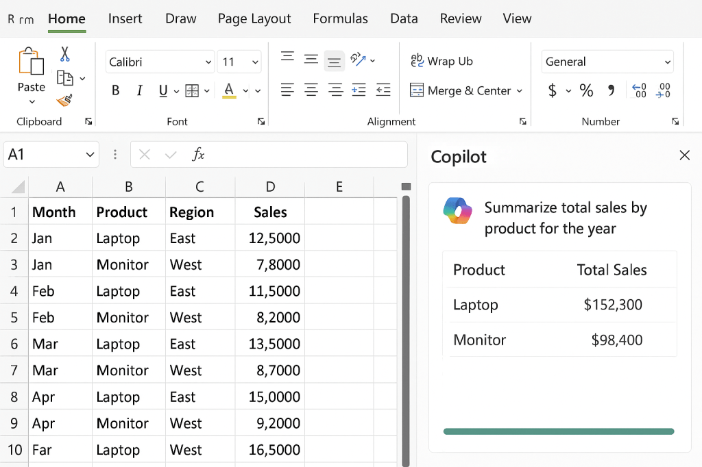
Step 2: Summarize Sales with Microsoft Copilot
👉 Prompt example:
“Summarize total sales by product for the year.”
Copilot instantly produces:
| Product | Total Sales |
|---|---|
| Laptop | $152,300 |
| Monitor | $98,400 |
This shows how Copilot in Excel can replace manual calculations with natural language queries.
🔗 Learn more: How Copilot works in Excel.
Step 3: Create Charts Automatically
Visualizing data is one of Excel’s biggest strengths. Instead of formatting charts yourself, just ask Copilot.
👉 Prompt example:
“Create a column chart showing monthly sales by product.”
Copilot generates a professional chart in seconds.
✅ Pro tip: Using Microsoft Copilot charts in Excel makes reporting faster and more visually engaging.
🔗 Related: Microsoft 365 blog: Copilot transforms Excel.
Step 4: Find Trends with Copilot Insights
👉 Prompt example:
“Analyze sales by region and highlight the one with the lowest growth rate.”
Copilot responds with insights like:
“The East region shows slower growth compared to the West, averaging 3% vs. 8% growth per month.”
This is a perfect example of AI data analysis in Excel.
🔗 Read more: How to analyze data with Excel Copilot.
Step 5: Run What-If Scenarios
One of the most powerful uses of Excel with Copilot AI is scenario modeling.
👉 Prompt example:
“If sales of Laptops increase by 15% in Q3, what will be the total projected revenue?”
Copilot instantly generates a projection—without you needing to build complex models.
🔗 Explore: Using Copilot for scenario planning.
Benefits of Microsoft Copilot in Excel
Here’s why professionals are adopting Copilot in Excel for business intelligence:
- Eliminates manual formulas
- Accelerates reporting and dashboards
- Supports decision-making with AI insights
- Accessible for all skill levels
By combining Excel AI automation with human decision-making, teams save time and reduce errors.
Final Thoughts: Microsoft Copilot is the Future of Excel
With Microsoft Copilot in Excel, anyone can analyze, summarize, and visualize data like a data analyst—without needing advanced Excel training. Whether you’re managing sales, finance, or project data, Copilot can simplify your workflow and unlock smarter decisions.
👉 Next step: Open your own spreadsheet and ask Copilot to summarize, analyze, or chart your data. You’ll see how fast AI can transform your work in Excel.
🔗 Extra resource: Official Microsoft Copilot overview.

Leave a comment